
How to Create an Application Map That Actually Gets Used
A practical guide to visualizing your IT landscape—without overwhelming your audience

Enterprise architecture (EA) offers powerful tools for understanding and managing complexity. One of the most essential is also one of the most traditional: the application map. It shows what applications your organization uses and where change is needed.
But just like any EA deliverable, the value of an application map depends on how well it’s built—and whether it gets used at all.
Here’s how to create one that works.
Why Application Maps Still Matter
Most organizations have a list of applications somewhere—usually in an Excel sheet, CMDB, or ITSM tool. But that’s not the same as having a clear, usable, and up-to-date view of your IT landscape.
A well-structured application map does more than inventory applications. It:
Supports modernization planning
Highlights risks and unnecessary complexity
Provides transparency across business and IT
Serves as a foundation for prioritization and governance
Its value grows when enriched with attributes like lifecycle status (e.g., Phase Out, Invest), business criticality, cost, and ownership.
While application mapping may seem less exiting and “strategic” than capability maps or future-state operating models, don’t underestimate its importance. Practical, accurate IT documentation is often what connects the big-picture strategy to what actually runs today. Without that bridge, strategy remains disconnected from execution.
What Counts as an Application?
Before you start mapping, define what you actually mean by application (or information system, as they are called in some contexts). In EA, this usually means:
Standalone software tools that support specific business needs
Tools with user interfaces, ownership, support processes, and a defined lifecycle
Logical entities (not infrastructure like servers or technologies such as operating systems)
Gray areas—such as shared data warehouses, user repositories, API gateways, operational technology, and ERP submodules—can be included if they’re used and managed as separate, identifiable systems.
💡 Don’t try to include everything technical. Focus on what matters for managing your IT portfolio and supporting business change.
How to Structure the Map
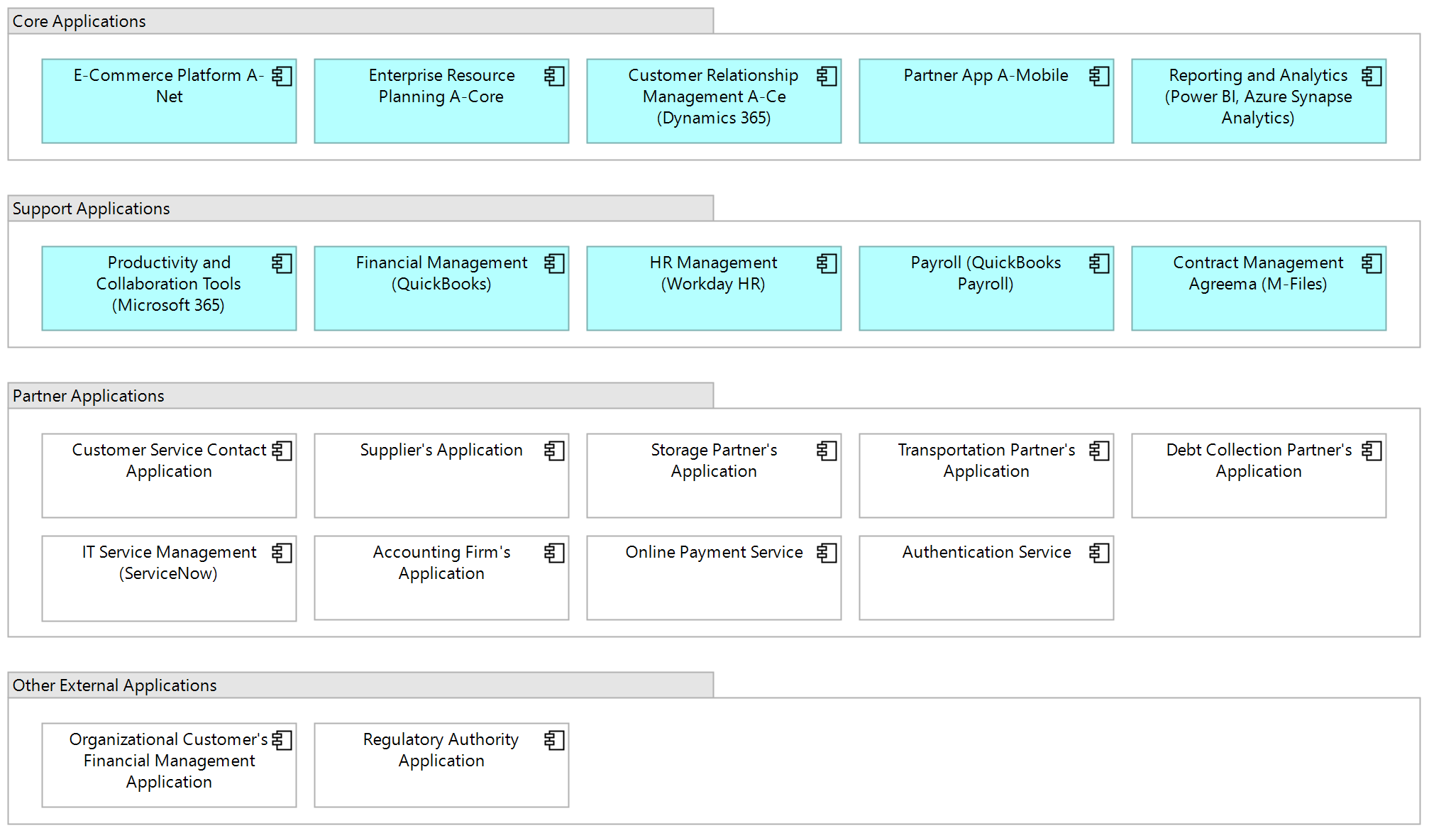
An application map offers a high-level view of your organization’s IT landscape. At its core, it’s a diagram showing which applications are in use—grouped and labeled in a way that supports understanding and decision-making.
You can organize applications in several ways:
By business area or capability (e.g., Sales, HR, Logistics)
By user group (internal, customer-facing, partner-facing)
By functional role (core applications, enablers)
By ownership (internally managed vs. external applications)
One view rarely fits all. A leadership-level map might highlight key applications by business capability, while IT teams need a more detailed version covering the full portfolio. Instead of cramming everything into a single diagram, create tailored views based on purpose, domain, or audience. More detailed diagrams—like application breakdowns or software architectures—can be developed separately. Likewise, data flows and integrations are essential parts of EA, but they’re outside the scope of this post.
If your map includes external applications (like those of customers, partners, or regulators), represent them visually—using, for example, a white fill or dashed outline to distinguish them.
Naming also makes a difference. Many applications have several internal nicknames, or they are referred to by their technology. Use composite names that clarify purpose, internal designation (if any), and main technology, like:
Customer Portal ServiceHub (Salesforce Experience Cloud)
ERP Centra (SAP S/4HANA)
Integration Platform (MuleSoft)
This helps non-technical users understand what each application is for—and what it’s built on.
The simple example below illustrates these principles.
Works in Any Tool
You don’t need a specific tool to create a solid application map—this approach works whether you’re using a full EA platform or just PowerPoint.
With a modern EA tool, you can often generate filtered views and heatmaps automatically. Without one, it just takes a bit more manual effort: maintain a master version (in slides, diagrams, or spreadsheets) and create targeted views as needed.
💡 Even if your source model uses ArchiMate or another formal notation, that doesn’t mean you should always present it that way. In leadership discussions, a clean, clearly labeled PowerPoint map often lands better than a pastel-colored modeling diagram.
Keep It Updated and Useful
Even the best application map is just a snapshot—unless someone owns it. So, you have to make maintenance part of your EA process:
Align updates with your planning and development cycles (e.g. IT portfolio decisions, project quality gates, and EA reviews)
Set clear ownership for each application or domain
Use attributes that can be refreshed automatically from reliable sources (like lifecycle status from your ITSM tool)
And always ask: is this map being used? If not, simplify, reframe, or refocus it.
Final Thoughts
When done right, an application map is more than a diagram—it’s a living planning tool that supports alignment, modernization, and transparency across business and IT.
Start with what you have. Organize it. Make it easier to read. Then add value where it matters most—like lifecycle insights, ownership, or criticality.
And remember: You’re not just mapping applications. You’re giving your organization the clarity it needs to make smarter, faster decisions.
📬 Want more no-nonsense enterprise architecture content? Subscribe to Enterprise Architecture Transformation for weekly practical insights.