
Visualizing What Matters: Using ArchiMate Layered Diagrams in Practice
A practical way to connect people, processes, and applications in enterprise architecture

Enterprise architecture (EA) work often involves making complex structures and interactions understandable. One of the most effective—and often underused—tools for this is what I call a layered diagram: a high-level view that connects process steps, user roles, and supporting applications into a single, cohesive flow.
This is important to clarify up front. Some may think of a “layered diagram” as any model that includes elements from multiple architectural layers. But here, I’m specifically referring to diagrams that visualize an operational activity flow across layers—from business roles to process steps to IT applications.
It’s about tracing who does what, in what order, using which applications—and showing it all in one integrated view.
These diagrams are especially useful early in development, during change planning, or when detailed process modeling (like BPMN) isn’t practical—or even necessary.
In this article, I’ll walk through what layered diagrams are for, why they’re useful, and how to build them in a way that adds real value. A concrete example follows to ground the concepts in practice.
Why Use Layered Diagrams?
A layered diagram gives a structured overview of how a solution or a business process operates across three core dimensions:
People (roles, teams, business units or organizations),
Processes (key processes, steps or activities),
Applications (supporting systems and tools).
They are a practical tool when you need to understand or explain how people, processes, and systems interact—without getting lost in unnecessary detail. They’re especially useful when you want to zoom out just enough to see the big picture, but still stay grounded in what actually happens.
They work well in a variety of contexts, including:
Planning how new solutions will support end-to-end business processes
Improving existing processes, especially when the current way of working needs to be made visible before it can be changed
Understanding how current applications support or constrain business activities
Clarifying cross-functional interactions and system dependencies
Bridging the gap between business and IT during change initiatives
Onboarding new team members, helping them grasp how things work across roles and applications
Supporting training efforts, by providing a high-level operational overview without drowning in detail
Providing a fast, structured alternative to detailed BPMN or technical process modeling
Whether you’re designing the future or making sense of the present, layered diagrams help tell the story of “who does what, with what, and in what order”—clearly, visually, and effectively.
Compared to other methods (like BPMN), layered diagrams are:
Faster to create
Easy to understand for non-specialists
Integrated with your overall EA, ensuring traceability between business and application layers
Scalable, from high-level overviews to detailed process interactions
What to Include—and How Much?
A layered diagram isn’t meant to be exhaustive—it’s meant to be useful. A good rule of thumb: include just enough to explain the solution clearly in a workshop or planning session. No more, no less.
Typical elements include:
Business roles or actors (top row): Who does what?
Business processes, activities or tasks (middle row): What happens, and in what order?
Application components (bottom row): What systems support each step?
In more detailed diagrams, you can also include:
Data flows between applications (only if relevant to the activities)
Decisions or branches within the flow
Key business events that guide the process
Key data elements used or transformed in the process
Model What Matters—and When
For smaller initiatives, a single high-level diagram is often enough. For more complex changes—like a new ERP implementation—you might need a series of layered views, each focused on a specific value stream or process. This approach is especially helpful early in a project—when detail is scarce but alignment is crucial. Later, you can refine the model or break it into more specific diagrams if needed.
When it comes to current vs. target state, start with what you’re aiming to build. In new solutions or processes, it usually makes most sense to begin directly with the target state. If the target feels too abstract or difficult to design from scratch, then it can help to sketch the current state first—for clarity and contrast.
When the goal is to improve an existing process, current-state mapping becomes essential. It provides the baseline from which improvements are made. The key is to let your modeling follow your intent: are you creating something new, or improving what’s already there?
And yes—you can absolutely use layered diagrams to describe an entire organization’s process architecture. But resist the urge to model everything at once. Prioritize what’s most valuable for upcoming changes, strategic initiatives, or pain points. A well-prioritized set of diagrams will serve your organization far better than a vast, unused repository.
Diagram Principles and Best Practices
To make your diagram clear and effective, consider these practical principles:
Keep roles on top, processes in the middle, applications at the bottom: This visual hierarchy helps the viewer quickly understand who’s doing what with which system.
Map one end-to-end activity flow per diagram: This keeps the focus clear and helps avoid overcrowding. For example: order-to-cash, hire-to-retire, or incident resolution.
Use clear, business-relevant labels: Label process steps based on what they actually represent for the business, not internal terminology.
Show application support—but don’t overcomplicate: You don’t need to show every integration or API. Just show which applications support which activities. You can add key data flows if they help tell the story.
Use ArchiMate’s Business Process, Application Component, and Role/Actor elements: These keep the model consistent and integrable with broader EA work.
Model what’s real, not just ideal: Especially in current-state views, showing actual process pain points or workarounds makes the diagram much more valuable.
Use an appropriate level of detail: Too much information leads to visual noise—especially when lines start crossing and clarity is lost. Instead of cramming everything into one diagram, break the flow into smaller parts or simplify what you show.
Add process details when needed: Include lead times, workloads, or other key metrics if the diagram is used for process improvement, such as in lean analysis. These details help turn the visual into a development tool—not just documentation.
Reuse existing elements from your EA repository: If you’re working with a shared architecture repository, reuse at least application, role, and actor elements whenever possible. It improves consistency, traceability, and model quality across your architecture landscape.
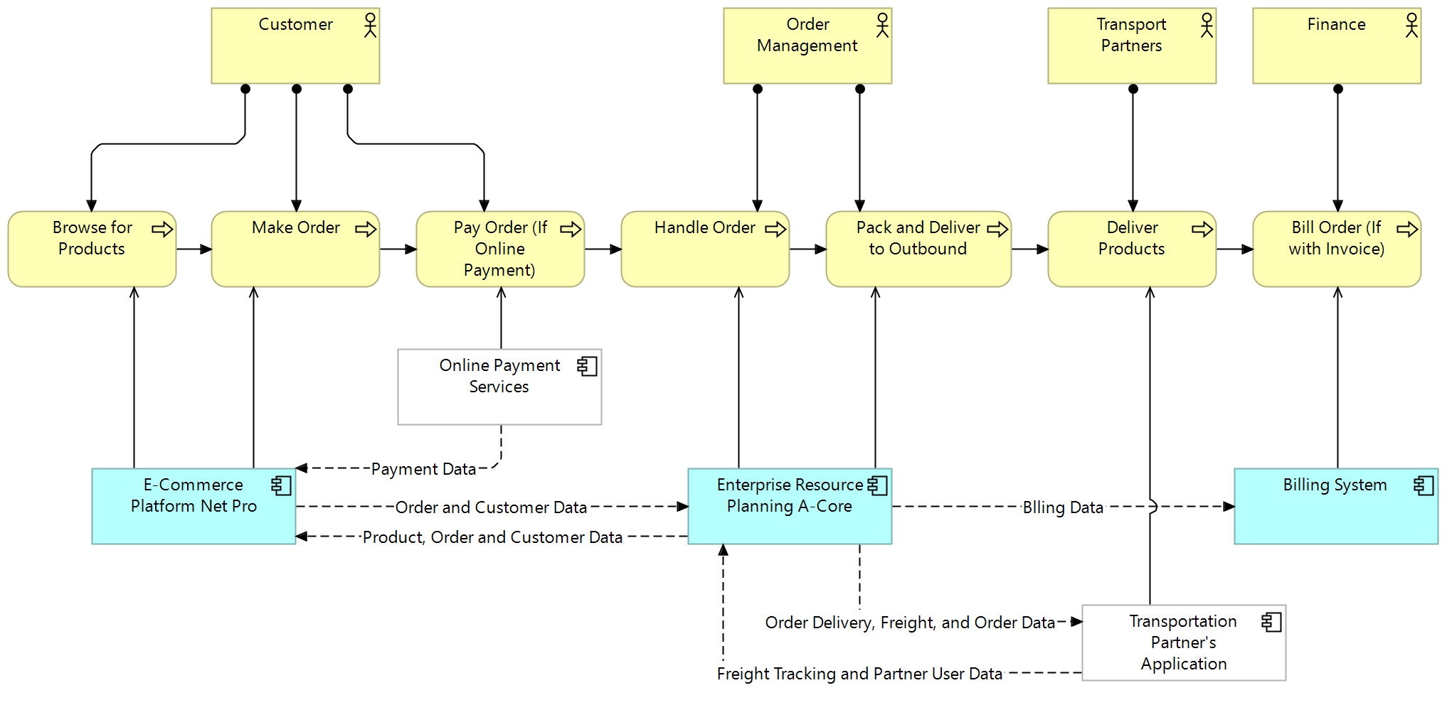
Example: Order-to-Delivery Flow
Let’s look at a simplified example: the order-to-delivery process in a retail context. The diagram shows how a customer places an order, how internal teams handle and fulfill it, and how applications support each step.
You’ll notice:
Each step is aligned with the responsible actor
Supporting applications are linked directly to the relevant tasks (external applications in white)
Data flows are included only where they help clarify dependencies
This diagram could be used to:
Prepare for an application replacement
Identify process gaps or duplications
Discuss responsibilities across departments
Align on what integrations matter (and which don’t)
Final Thoughts
Layered diagrams are one of the most versatile tools in an architect’s toolkit. They’re quick to create, easy to explain, and powerful in how they reveal the interactions between people, processes, and technology.
You don’t need to model everything. You just need to model what matters—in a way that makes sense to your audience.
Whether you're preparing for a new initiative, analyzing a current pain point, or facilitating cross-team dialogue, a well-crafted layered view can often do more than a 50-slide deck.
It’s architecture people can actually read.
✍️ Author News
Right before the holidays, I wrapped up reviewing the copyedited manuscript of my upcoming English-language EA book. The first proof—and the cover—just landed in my inbox for feedback.
📘 And now it’s official: Enterprise Architecture: Your Guide to Organizational Transformation is available for preorder!
→ Read more and order here (also available from Amazon and local bookstores)
It’s a practical guide to leading change with EA—no buzzwords, just real tools for real organizations.
On the fiction side, I recently signed a publishing contract for a new children’s book, and I’ve already started writing another. And last week, I begun working with a literary editor to shape my debut novel into publication-ready form. These projects will be in Finnish.
If you’re curious about my writing journey—whether it’s enterprise architecture, fiction, or children’s books—you can follow along on my Facebook author page or Instagram. I sometimes share aviation stories there, too. (Content in Finnish or English, depending on the project.)
📬 Want More Practical Enterprise Architecture Content?
Subscribe to Enterprise Architecture Transformation for real-world advice on architecture that supports change, strategy, and delivery.